
Design guide & FAQ
How to get your logo print-ready: which art treatment to pick for a debossed riser face, why bold artwork wins, and a five-minute trick that makes a busy logo look like it was designed for the riser.
Line art vs. silhouettes — what's the difference?
Your logo is debossed — engraved into the riser face — so Line art reads by light and shadow. The studio gives every logo you upload two ways to become that engraving, and picking the right one is most of the battle.
The upload
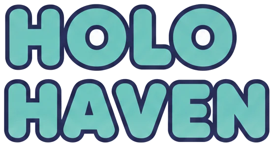
A bubble-letter wordmark — solid shapes with holes in the letters. Watch what each treatment does with it.
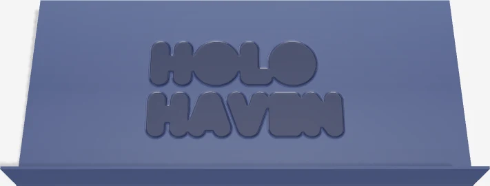
Filled
Debosses your logo's silhouette — the whole solid shape sinks into the face. Perfect for icons, badges, and single bold marks. But on bubble letters or a solid wordmark it does exactly what you see above: the letters merge into one recessed blob and the name disappears.
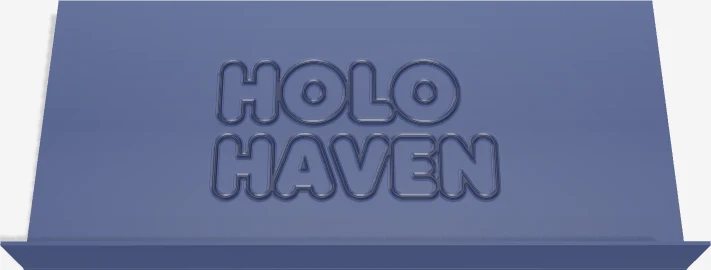
Line art
Traces your logo into clean engraved grooves, so every letter and detail stays a separate stroke. The same wordmark now reads perfectly. Pick this for lettering, bubble letters, and detailed artwork — the trace is generated for you, right in the studio.
Real renders from the design studio — the same live preview you get with your own logo.
Why fine strokes don't print
The face you're designing on is about 174 × 81 mm (6.8 × 3.2 inches), and it's a physical, molded surface — not a screen. Any stroke or gap below 0.45 mm at the size you place it is below our hard print floor even with a fine 0.2 mm nozzle. A standard 0.4 mm nozzle generally needs about 0.8–0.9 mm to keep a groove open, and detail approaches 1 mm before it reads clearly instead of filling in or rounding off.
That's why bold artwork always wins on a riser face. A chunky mark engraved deep and clean beats an intricate one that arrives as mush — every time.
You don't have to eyeball it: the studio measures your art live at its placed size. Below 0.45 mm, ordering is blocked with specific fixes. Above that hard floor but below the 1 mm clarity guide, you get a warning and must confirm you're OK with a fine nozzle and possible simplification.
Which should I pick?
One thing first: we engrave flat, solid artwork — logos, wordmarks, icons, line art. Photos, gradients, and shaded illustrations can't be reproduced on a molded face and aren't supported.
The engraved example is a real render from the design studio.
A solid icon, badge, or single bold mark
FilledThe silhouette is the logo — let it sink in as one clean shape.
A wordmark, bubble letters, or anything with text
Line artGrooves keep every letter separate and readable.
A busy composition — mascot + name + taglines in one image
Line art — split if neededA single wordmark or icon is fine as one upload. If the whole lockup is too much for one riser, see the pro tip below.
Thin lines or detail below the 1 mm clarity guide
Enlarge or simplifyBelow 0.45 mm is blocked even with a 0.2 mm nozzle; a standard 0.4 mm nozzle needs about 0.8–0.9 mm.
A photo, gradient, or shaded illustration
Not supportedConvert it to a flat, bold logo first — the pro tip below has a ready-made AI prompt — or email support.
Logo too busy for one riser? Split it into pieces
Most logos don't need this — a single wordmark or icon traces beautifully as one upload. This tip is for the dense ones. Say your shop is Holo Haven Cards and your logo is the full lockup: star mascot, bubble-letter name, a ribbon of secondary text, sparkles. Traced as one image, all of that has to share one riser face — the small text turns to mush. We've seen it in production, and the fix is simple: upload the wordmark and the mascot as two separate logos. Each one gets traced and sized on its own terms, and the result prints dramatically better.
The upload
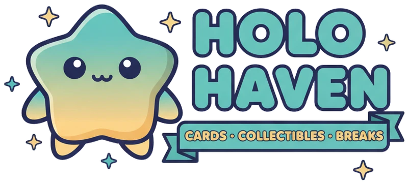
One dense composition: mascot + wordmark + banner + sparkles.
Traced as one image
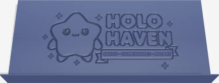
✗ Everything shrinks to fit. The banner text goes to mush and the sparkles all but vanish — real render from the design studio.
How to split it in five minutes
- Open ChatGPT, Gemini, or any AI image tool and attach your logo. Ask it for each element separately — copy these prompts:
Prompt 1 — the wordmark
"Extract just the wordmark — the shop name text — from this logo. Put it on a transparent background, nothing else."
Prompt 2 — the mascot
"Extract just the mascot character from this logo. Put it on a transparent background, nothing else."
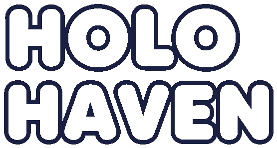
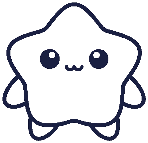
What the prompts hand back: each element on its own, ready to upload.
- Save each result as a PNG.
- In the studio, upload each PNG as its own logo (you get up to three per set) and pick Line art for each.
- Drag and size each piece separately on the face — mascot on one side, name on the other, whatever suits your brand.
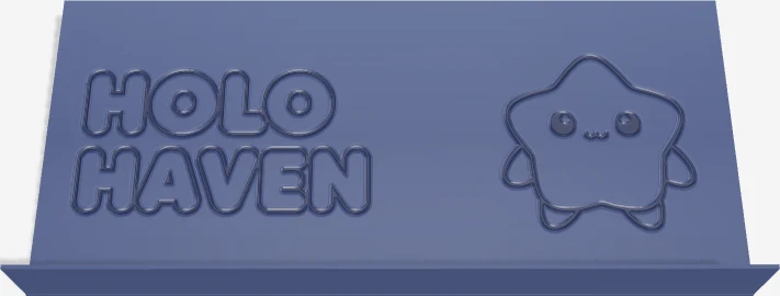
✓ Two separate logos. Wordmark and mascot each traced bold, placed side by side, sized independently.
No AI tool handy? Cropping each element out in any image editor works just as well. And if your logo is busy but you'd rather keep it as one piece, ask the AI to "Simplify this logo to bold shapes that would read well engraved into plastic — no fine lines, no gradients, transparent background."
Only have a photo or a shaded illustration? Those can't be engraved directly — we need flat, solid artwork — but the same trick turns one into a mark that prints beautifully:
Prompt 3 — photo or illustration → flat logo
"Redraw this as a flat, single-color logo with bold lines — no gradients or shading, transparent background."
Quick answers
What file types can I upload?
PNG, SVG, JPG, and WebP. A PNG with a transparent background (or an SVG) gives the cleanest result because we know exactly where your art ends. JPGs work too — we remove the background automatically. Whatever the file type, the artwork itself needs to be a flat logo or mark, not a photo (see the next question).
Do you clean up my upload?
Yes, automatically. Every upload gets its background removed and gets trimmed to the artwork, and you see the cleaned result in the 3D preview immediately. What you see on the riser face is exactly what we produce.
Can I use a photo or a detailed illustration?
No — we engrave flat, solid artwork: logos, wordmarks, icons, line art. Photos, gradients, and shaded or highly detailed illustrations can’t be reproduced on a molded face and aren’t supported. If a photo or complex illustration is all you have, ask an AI image tool to redraw it as a flat, bold, single-color mark first (the guide above has a ready-made prompt), or email it to [email protected] and we’ll help you get there.
Why did my logo turn into one solid shape?
That’s the Filled treatment doing exactly what it says on solid artwork: it debosses the whole silhouette, so bubble letters or a solid badge become one recessed blob and the lettering disappears. Switch that logo to Line art — it traces the artwork as grooves, so letters and details stay readable.
My logo has thin lines — will they print?
Enlarge or simplify it first. Below 0.45 mm the studio blocks ordering because even a fine 0.2 mm nozzle can’t keep the groove open. With a standard 0.4 mm nozzle, details generally need about 0.8–0.9 mm to stay open, and about 1 mm to read clearly.
Can I see it before you print?
Yes — the live 3D preview shows your exact riser, and when you order, your design is saved with a design code (CR-XXXXXXX) that rides along with your order. You can reopen and share the design with that code, and we produce from the same saved design, so there are no surprises.
How big is the printable area?
The riser face is about 174 × 81 mm (roughly 6.8 × 3.2 inches). You drag and scale each logo anywhere on that face in the studio, and the preview keeps everything within the printable area for you.
What does a set cost?
Every set is a full Zion case of 24 risers, in two tiers. The half-case set — the studio default — carves your logo into half the risers and fills the rest with our classic diamond-lattice risers in your colors. The full-case set puts your logo on all 24. Current prices are on the Custom Logo Risers page, and the studio total updates live as you design.
What happens to the diamond lattice?
Our classic risers have a diamond-lattice face. Custom logo risers replace that lattice with a solid face plate — the smooth canvas your logo is engraved into. Risers in your set that don’t carry the logo stay classic diamond-lattice risers, which is the studio’s default half-case set: your logo on one color of a two-color layout, our signature lattice on the rest, at a lower price than logo-on-all-24. The 3D preview shows exactly which risers get which face before you order.
What if my logo is too detailed?
Three good options: make it bolder (ask an AI image tool to “simplify this logo to bold shapes”), split it into separate elements and upload each one on its own, or email it to [email protected] and we’ll prep it for you.
Ready to see your logo on a riser?
Upload it, pick a treatment, and watch it live in 3D — no commitment until you order.
Want a hand with your art? Email [email protected] — send your logo and we'll prep it for you.